
Your firm’s logo is more than a mark on your website. It’s the visual signature clients, referral sources, and your professional network come to recognize. LawLogo provides custom attorney logo design for solo attorneys and firms of 2–10 lawyers that want a professional identity without looking like every other practice in town.
Law firm logos designed. None for anyone else.
From brief to first concepts in your inbox.
Production-ready for web, print, and court filings.
Yours outright. Full ownership at handoff.
It’s on your website favicon, your court filings, your business card, and the sign on your door. It’s the one design decision a prospective client sees dozens of times before they ever call — which means a weak one doesn’t just look unfinished once, it looks unfinished everywhere, repeatedly.
Scales of justice, gavels, and courthouse columns aren't identity — they're wallpaper. When most firms in your practice area reach for the same handful of symbols, a prospective client can't actually tell you apart by looking.
A mark built around a trendy font or effect looks dated within a few years and gets expensive to replace. We design around your practice's identity, not this year's design trend.
A logo that looks fine on a screen can fall apart printed on a business card or shrunk to a 16-pixel favicon. Every mark we deliver is tested at the sizes it will actually be used at.
Every principle below exists for a reason specific to how legal clients evaluate a firm — not generic design-agency advice borrowed from another industry.
Most first impressions of your firm now happen on a phone screen or as a browser favicon, not a business card. A mark with too much detail turns into a smudge at that size — we design and test every concept at the smallest size it will actually appear.
A logo built around this year's popular typeface or gradient style looks dated within a couple of years, and rebranding erodes the recognition you spent that time building. Legal clients are also slower to trust firms that appear to reinvent themselves often.
A logo that tries to communicate every practice area, value, and credential at once ends up communicating none of them clearly. The strongest legal marks carry one idea well — your name, your initials, or a single distinguishing element — and let the rest of your brand carry the detail.
Legal clients are a conservative audience evaluating risk. A logo that's unusual purely to stand out can read as unserious before anyone's read a word about your practice. The goal is distinctive within the expectations of the profession, not distinctive despite them.
A solo criminal defense attorney and a five-partner estate planning firm shouldn't end up with visually interchangeable logos. The right mark reflects your specific practice area and where your firm sits between approachable and formal — not a generic template adjusted only by color.
Some visual elements — seals, badges, or certification-style marks — can imply credentials or endorsements you don't actually hold, which creates real risk under state bar advertising rules. We avoid iconography that could be read as an implied claim, so your logo doesn't become a compliance question later.
Trusted by attorneys reaching over 660,900+ followers

Criminal Defense & Personal Injury
LAW OFFICES OF LORI MURRAY

“Working with LawLogo was an absolute game-changer for my practice. As a criminal defense and personal injury attorney, I needed a brand identity that felt authoritative, sophisticated, and trustworthy, yet distinct enough to stand out…..”

Immigration Lawyer
GHALIB LAW
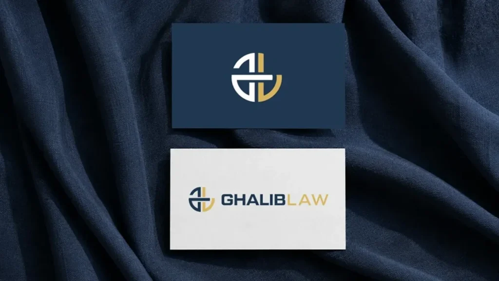
“LawLogo did an exceptional job designing a brand identity for Ghalib Law. As a practice specializing in U.S. immigration law, we needed a visual presence that felt welcoming, trustworthy, and refined. LawLogo translated our vision into clean, modern design assets that represent our firm with complete professionalism. Their turn-around time, communication, and craft were impressive from start to finish.”

“ LawLogo.co did an excellent job! I didn’t have a clue as to what I wanted my logo to look like, but their skills and creativity produced the perfect design. I highly recommend LawLogo.co and will definitely work with them again! ”
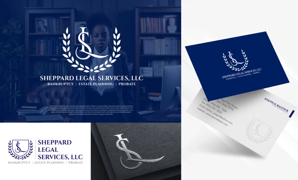
A short intake covering your practice area, your ideal client, and any existing branding you want to move away from or build on.
First concepts arrive within 48–72 hours. Every attorney logo design concept is created specifically for your firm — nothing pulled from a stock library.
Web and print-ready vector files, delivered with full copyright ownership — usable on your website, filings, signage, and stationery.
Looking beyond the logo? Explore our law firm branding services to build a complete visual identity for your practice.
Concept count depends on the package, ranging from 1 original concept on the Starter tier to 8 concepts on the Firm Identity System tier. Every concept is designed specifically for your practice, not pulled from a template library.
Yes. Once your final logo is approved and the project is paid in full, you receive full ownership of the design, including the right to trademark, print, and use it without restriction.
Crowdsourced platforms have many designers submit competing concepts with limited context about your practice, and you choose the least-bad option. LawLogo assigns a single designer or small team who works from an actual intake about your firm, your practice area, and your ideal client.
Yes. Every completed logo is delivered in both web formats (PNG, SVG) and print-ready vector formats (AI, EPS, PDF), so the same mark works on your website, business cards, court filings, and signage.
First concepts are typically delivered within 48 to 72 hours of a completed intake, with total project timelines ranging from about 5 days on the Starter package to a few weeks on the Firm Identity System package, depending on revision rounds.
Yes. The Premium and Firm Identity System packages include a broader identity system — color palette, typography, and stationery layouts — beyond the logo mark itself, and full brand identity projects are also available separately.
Not necessarily. These symbols are heavily overused across the legal industry, which makes it harder for a logo built around them to stand out. A mark built around your firm name, initials, or a more distinctive element tends to differentiate better while still reading as professional.